MARKETING
Why your logo is (somewhat) irrelevant
The role of recognition and recall in branding

As designers we are always seeking to create products and graphics which are memorable to consumers and which form a strong brand association. That’s why my interest was captured when I came across a research study by sign-and-design company signs.com, in which they asked 156 people to draw the logos of ten well known brands from memory.
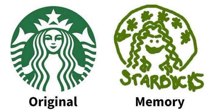
Each participant spent roughly three minutes drawing each logo, then they rated their own accuracy and indicated their level of engagement with the brand.
The drawings were subsequently rated for accuracy by a panel of five design and marketing professionals, who assigned a score out of 10 based on the included features, proportions and colour palettes.
Example 1: Starbucks
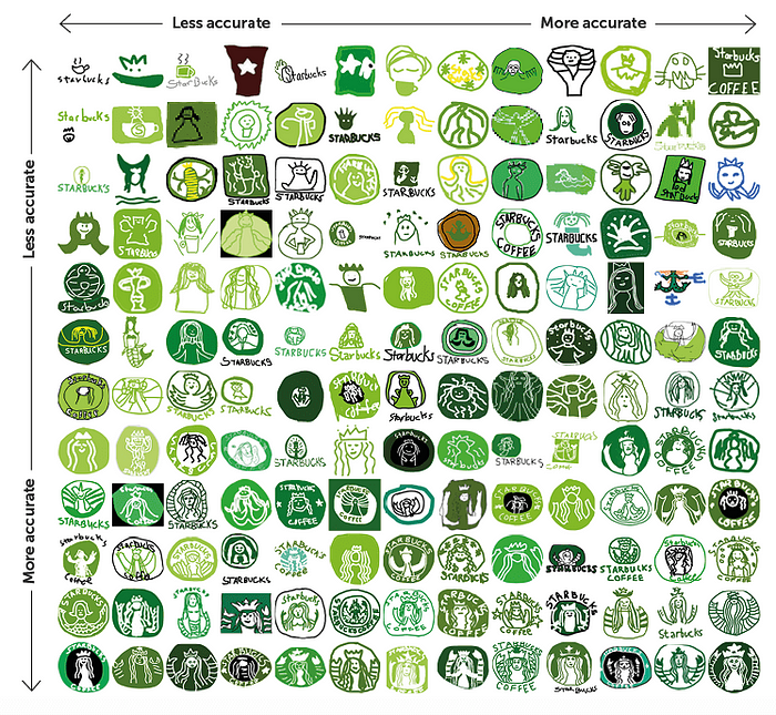
The composite image above shows a variety of drawings of the Starbucks logo. The vast majority of people recalled the correct colour; this held true across the entire experiment, with 80% of people selecting the correct colour for their drawings.
Exact shapes are harder to recall, especially complex shapes like the Starbucks logo, and it’s apparent from this example that approximately half of the participants drew the mermaid but forgot her tail or crown.
A third of participants drew the old Starbucks logo with the brand name included (until 2011 the word “Starbucks” was included as part of the logo). This also happened with other brands; in numerous cases participants drew the old logo instead of the current one (for example, see below where some participants coloured the Apple logo with the rainbow stripes used prior to 1998).
Example 2: Apple
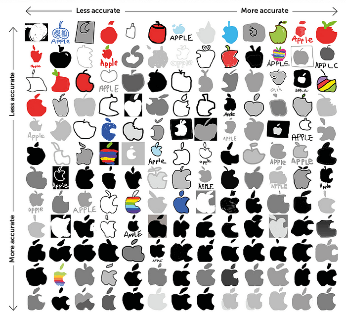
The Apple logo is a much simpler shape, which made it easier to recall. 20% of participants recalled the Apple logo with near-perfect detail, as opposed to only 6% who recalled the Starbucks logo accurately.
The most common mistake, made by a third of participants, was to add a stalk when in fact there isn’t one. This points to the hypothesis that people know the logo is an apple and are referring to an idealised image of an apple in their memories, rather than the specific apple in the logo. 6% of participants reinforced this by colouring the logo red, again probably referring to their remembered idea of what an apple looks like.
Example 3: Burger King
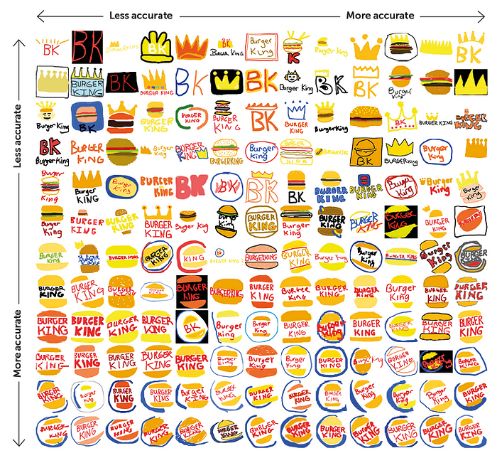
Participants’ drawings of the Burger King logo were particularly interesting, because they occasionally drew a crown shape instead of a burger in a blue circle. Burger King did once use a crown in its marketing (1957–1969), but the researchers concluded that the participants were unlikely to recall this due to their ages (average age 34). Instead it was more likely a cognitive response to the word “king”, or related to the “king” character featured in adverts.
This occurred with several of the brands in the study; participants occasionally drew a different symbol that the brand uses in its advertising but which isn’t the official brand logo.
Confidence and accuracy

Interestingly, participants were generally over-confident about their own accuracy in recalling what each logo looked like. It’s a well known fact that people’s expectations of their own performance are often an overestimate of reality; this is not self-deception or wishful thinking, but a genuine bias towards believing that information yielded by one’s own cognitive system is accurate.
The participants’ level of brand engagement made no difference to whether they recalled a logo correctly; however, there was an age-related difference, with older people recalling the logo less accurately. The researchers advanced no hypothesis as to why this was the case, but it’s unlikely to be due to age-related cognitive decline (as stated previously, the average age of participants was 34).
But… ability to recall a logo doesn’t matter
I was going to write a conclusion about the factors that make logos memorable… when I realised something.
The fact is, this study (whilst fascinating) is somewhat misdirected. In the real world there is literally no situation in which someone would need to recall a brand logo from memory. What matters is recognition. When someone sees the logo do they know which brand it belongs to?
As Jeff Johnson explains in his book “Designing with the Mind in Mind”: Perception creates a pattern of neural activity in the brain, which is matched to an existing pattern stored in the memory, and we call this process recognition.
This explains why recognition is easier than recall: recognition involves the comparison of current sensory input with stored information, whereas recall requires retrieving information from memory without external prompting.
Recognition is what’s important when it comes to branding
Psychology experiments in the 1970s established that humans have an amazing capacity to recognise images — they can recall thousands of images at high accuracy even if they only saw them for a few seconds, and their memory for images is almost limitless. Moreover, humans are demonstrably better at recognition than they are at recall.
Recognition, however, does not require an exact match. If a brand looks close enough to how we think it should, we recognise it.
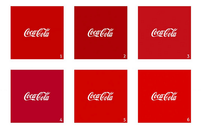
For example: Which is the correct Coca Cola red?
If you saw the brand displayed with one of the other red shades, would it prevent you recognising it as Coca Cola? Probably not.
This raises the question of how precisely a brand colour needs to be defined. The fact is, our colour memory tends to be imprecise.
Going back to the signs.com logo research study, here’s an image showing the different greens that each participant chose to represent the Starbucks logo:

Only 21 participants (13%) came within 10 DE2000 of the true Starbucks green (commercial tolerance for printing is within 3 DE2000). Despite that, the vast majority of the drawings are recognisable as the Starbucks logo — personally I would recognise about 80% of those logos as Starbucks — and the deciding factor in many cases is the accompanying text, not the precise colour or shape.
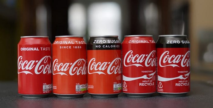
There are a number of related issues here, such as the fact that human memory for colour is fallible. We also need to consider the issue that colours are not consistent across different types of printed materials (or even across different batches of the same material) and everyone’s screens are calibrated differently. Coca Cola themselves admit there is no such thing as Coca Cola red.
For an in-depth examination of how the human brain perceives colour, I recommend “The Interaction of Color” by Josef Albers.
Fortunately, our brain’s capacity for recognition doesn’t rely on an exact match; it merely needs to be close enough and not easily confused with an alternative.
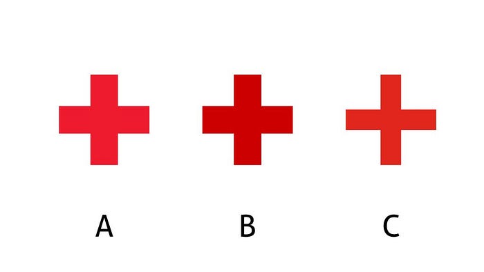
Shape, however, is a different kettle of fish. You may find it difficult to identify the correct logo for the Red Cross, but you probably find it much easier to identify the wrong one — because the shape is different.

This 1951 Canadian yellow Coca Cola sign looks a bit odd, but it’s still easily recognisable as Coca Cola for a number of reasons, including the distinctive text and the shape of the glass bottle. This relates back to the signs.com study where people incorrectly drew the Burger King logo as a crown. Consumers learn to recognise a number of brand assets, of which the logo is only one, and the overall impression is what gives rise to recognition.
So where does recall come into it?
Recall is about whether a brand comes to mind when prompted. For example, if you were asked to think of a fast food brand and you said McDonalds, that suggests high recall for that brand. It doesn’t matter if the consumer fails to recollect the logo or colour; what matters is their general awareness of the brand and its products or services.
The relative power of recall vs recognition is represented by the Graveyard Model (developed by Young and Rubicam Europe, as quoted by Aaker, 1996).
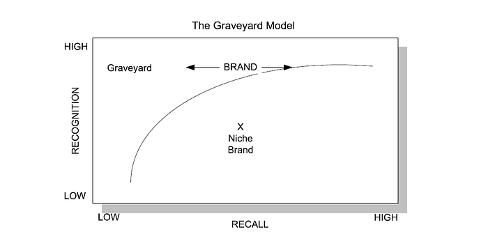
The Graveyard Model plots brands on a recall vs recognition graph. Most brands follow the curved line — with two exceptions.
Firstly the Niche Brand (lower right), which has low overall recognition (not widely known) but has high recall among their loyal customer group. This brand may still perform highly and can increase its performance by widening its recognition among consumers.
Secondly the Graveyard (upper left) where the brand has high recognition but low recall. Customers know about the brand and recognise it, but it doesn’t come to mind when they consider purchase. This is problematic and the brand needs to work on strengthening its unique selling points.
Conclusion
The research study by signs.com highlights a crucial aspect of human memory: while recognition and recall are distinct cognitive processes, they are intrinsically related and both play vital roles in branding.
Key takeaways for designers
- Recognition and recall are different but related. Recognition helps consumers to identify brands, while recall supports brand loyalty and drives purchasing behaviour.
- Design logos for recognition. Use defined colours and simple shapes, and make the logo distinctive and consistent across different platforms.
- Recognition doesn’t require an exact match. “Close enough” is adequate for recognition in most cases.
- Differentiation is a key part of recognition. What matters most is that your brand is distinct and easy to differentiate from your competitors.
- Text is important to support brand recognition. Consumers will recognise a brand or logo more easily if it’s accompanied by the brand name.
- Avoid frequent changes. Consistent use of the same logo helps build a strong association in consumers’ minds, reducing confusion and enhancing brand recognition over time.
- Using strong symbols can aid brand recall. Consumers may not specifically recall the brand logo, but they may recall other symbols used in marketing, especially if these symbols have parallels in real world objects and concepts.
- Recall trumps recognition. It’s more important that consumers recall the brand as a whole rather than the specific logo or colour. Effective marketing ensures that the brand comes to mind when consumers are ready to purchase a product in the relevant category.

